[overlapping audio samples play over intro theme]
Kaleda Davis: If a library is free, why not a public theater?
Fernando Masterson: Theatre is a practice of—you know, it’s empathy, right? It’s—you’re watching something happen onstage—
Caity Joy Smith: Raccoons are very intelligent creatures.
Jeanine Tesori: Democracy and theatre, they have a deep relationship.
Jack Phillips Moore: The reason this is great is because it fundamentally understands what theatre is, which is, it’s a place for all of us to come together and appeal to something larger than ourselves.
Reynaldi Lindner Lolong: This is Public Square, a podcast of The Public Theatre.
RLL: Hi, I’m Reynaldi Lindner Lolong, Director of Digital Engagement here at The Public, and I usually co-host Public Square along with one of our Marketing Managers, Fernando Masterson. When Fern and I were brainstorming episodes for this season, this next guest was at the top of our list. But because of schedules and timing we weren’t able to conduct this interview until March 12, which turned out to be our last day in the office. We are incredibly grateful that we are able to bring you this episode and hope that you will enjoy listening to this episode as much as we enjoyed recording it.
Also, just a heads up: at around the 13-minute mark, you’ll hear a siren in the background. That’s part of the recording and fades out after about a minute. Feel free to skip ahead just so you know it’s coming.
RLL: Friends, we are coming to you from the offices of Pentagram. Pentagram is world’s largest independently operated design studio, and our guest today is Paula Scher. Paula is a partner here at pentagram, a leader in the field of design, and a great friend to The Public Theater. Paula, welcome.
Paula Scher: Hi. Nice to be here. In my own place.
Fernando Masterson: There we go. Well we’re glad to be here too. So here we are sitting in one of your beautiful conference rooms at Pentagram. And in front of us in your upcoming book, Paula Scher: Twenty-Five Years at the Public: A Love Story, and all love stories start somewhere, so can you kind of take us back and tell us how this love story began? And did you expect for things to turn out the way they did?
PS: Well it’s been a real journey and I have to say because my – my first understanding of The Public Theater was when I saw A Chorus Line on the steps of the Public Theater in 1974 and I thought it was magical and I thought the place was magical, and at that particular moment in time I knew about the Public because my husband Seymour Chwast who founded Push Pin studios was friends with an artist named Paul Davis who worked at Push Pin and Paul Davis was hired by Joe Papp to these big beautiful posters for The Public that Paul did for 19 years. And then at the time he designed them I was an art director at Columbia Records. I was a record cover art director for ten years before I went out on my own. And I worked with Paul and I certainly knew his work and how he was making those posters and what was phenomenal is that a lot of the shows that Paul did the posters for went to Broadway, and I was so impressed. So, as a professional, I didn’t just admire Paul’s work, I admired what the level of the Public’s thinking was.
Of course, people didn’t call it The Public then, they call it the New York Shakespeare Festival, the building was referred to as the New York Shakespeare building or The Papp because people named it after Joe Papp. And the press still for a long time after we said “no, this is The Public Theater”, and tried to make an identity that stood for that, still people in the press called it The Papp or the Shakespeare Festival.
George Wolfe hired me in 1994 after Joe Papp died. And Paul had told me that over a period of time, he had more difficulty making the posters as the celebrities thought it was natural that they would be on the poster, and that they would sit for the poster and he would be doing their portrait. So, from these brilliant ideas he did of a falling Sam Waterston or some wonderful action of the actors and movement, it was all changed to these rather stiff posters that were repetitive at the end of the process. And I think this happened as probably Joe Papp’s ability to navigate everything lessened as tends to happen and other sorts of directors became more powerful, or producers had a say, or the actors or actresses themselves did.
And when Joe Papp died, he was initially replaced by a woman named Joanne Akalaitis, and it was a period of two years, and I think that was a period of real confusion for the theater because she was taking over after the beloved founder had died. And George Wolfe later told me he was offered it then and definitely turned it down because nobody could follow Joe Papp. Which was probably true. When he took over, he thought he wanted to cleanse the visual palette. That there were several problems that happened for The Public and it was really all identity issues. Though they didn’t talk about it in terms of identity issues because people didn’t really use that word yet. But what the issues really were were that their were these different issues.
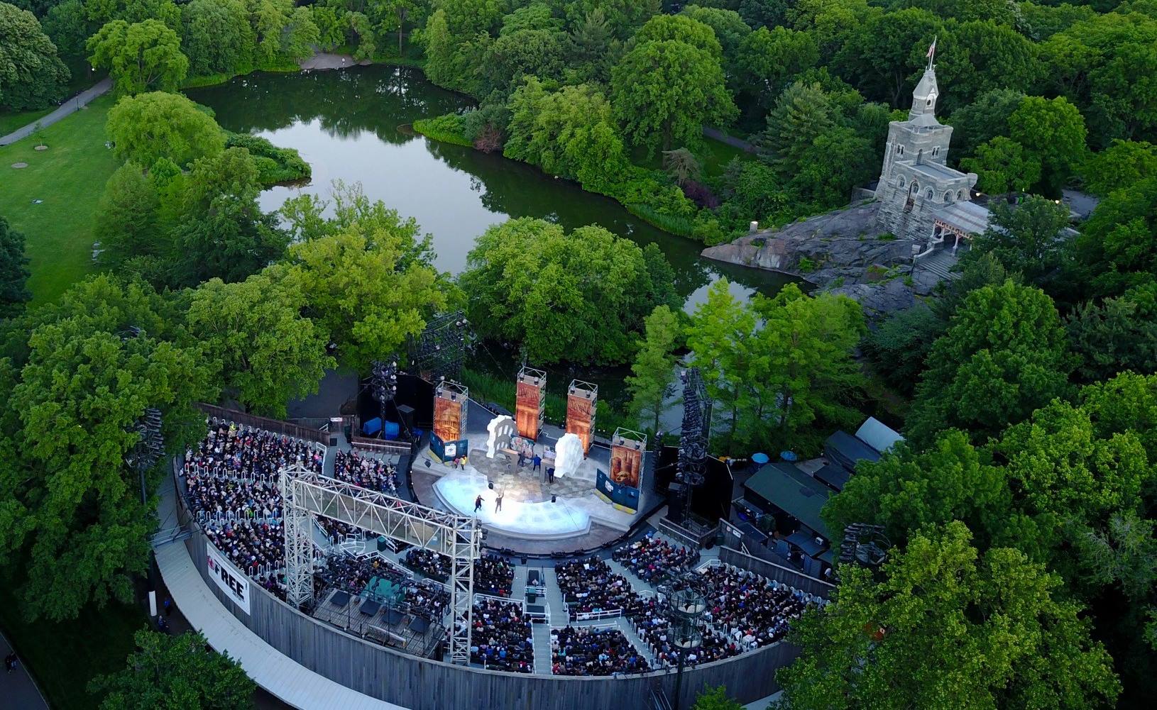
There was Shakespeare in the Park, that happened every summer, it was called the New York Shakespeare Festival, some people called it Shakespeare in the Park. If you see Woody Allen in Annie Hall, he says to Tony Roberts, "you should be doing Shakespeare in the Park", he doesn’t say you should be performing for the New York Shakespeare Festival. So then even amongst New Yorkers it was referred to differently. It was at a place called The Delacorte Theater, which you know most of New York didn’t know where it was or what it was. And then there was this building, the Astor Library, the old Astor Library downtown on Lafayette Street which was still a scary street in those days. Not a fancy section of Manhattan, but you know this downtrodden block around the corner from Cooper Hewitt – Cooper Union. And you know, next to a lot of grungy places. It was you know the beginning of 3rd avenue, Ukrainian neighborhood on the other side. You know it was where if you went to Cooper union you ate over there for two dollars. That kind of a neighborhood. Not an expensive fancy restaurant, nothing like that.
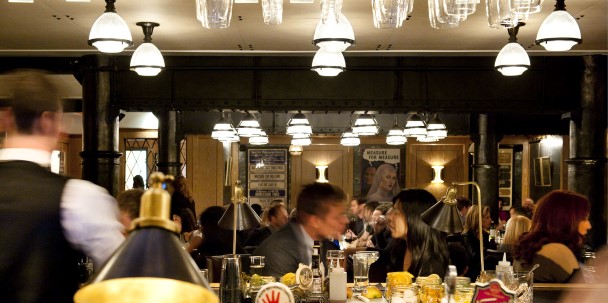
And the Astor Library was marble on the inside. George thought it looked like a bordello, because it had like glass mirrors in them that were kind of crazy and filled with gold leaf and the marbleized floor – I have pictures of it some place – it was pretty grim. And a very very ornate chandelier that looked strange. It was just there. It didn’t look like a public place. People didn’t call it The Public Theater. They called it – they called it was The Joseph Papp Public Theater as the official name of it, so they called it either the home of the New York Shakespeare Festival or The Papp.
Paul Davis inadvertently had created some confusion because during the end of the period that he had done posters for The Public he had also gotten a contract to design the posters for Mobile Masterpiece Theater which was on public television. So, people thought that The Public Theater was about education and therefore not really great. It was like the way people perceived educational TV: good for you but boring. That’s changed to a degree, but there was that spirit of it. And this came out in some market research that was done about The Public and that I was sent, this thing, along with two other design firms, and I was sent - they sent me the work because George had been shown or had seen two posters I had done one when I was still at CBS Records for Elvis Costello, and another poster that was purely typographic and he liked it.
So, they called me down and interviewed me. And then they didn’t make a decision. And then they called me again and they interviewed me again and then they didn’t make a decision. And then I didn’t hear from them for three months. Then I was told to write a proposal, then I wrote a proposal, then I went down again and nothing happened, and then I got a call, panicked, that they had to get a Shakespeare in the Park poster done, because they were out of time. They never actually gave me the job. I just did the Shakespeare in the Park poster, and then I had the job. That’s what happened.
But what was interesting was that this was done very quickly. It was a folded out mailer that looked like this, and it wasn’t The Public Theater type yet but what I knew from this exercise that was that the typographical approach for designing The Public was right because it gave them the ability, and this was of course pre-computer, to be able to quickly and easily change programming, if you had to change programming, so it was the basis of how I began doing things. Then I was hired to go ahead and do the identity and all the promotion, and they worked out some kind of retainer agreement, where I could just get paid monthly and I agreed to do really all the promotion and everything for the theater, and our goal was to change the name to get everyone to call it The Public Theater. And I would say in total it really took ten years for that to happen. Because it’s an iterative process. Identifies don’t really change overnight. You have to change the mind of the entire public.
I created a program that was based on a form of American wood typography, which comes out of London theater advertising. This was actually my model. And what I loved about it was that they didn’t have cute lines. You know, we started doing this advertising at the time, the audiences were used to seeing things like “The Wiz is a wow!” or you know things like that, that are a little bit embarrassing when you kind of read those lines. In London they would say the name of the play, who was in it, the date and the time, thank you ma'am just the facts. And it seemed very refreshing to me, to just be able to put something out there and let the respond to it, see an image that might be compelling, and so based on that you’re looking at is an image of my first sketch for all this typography, and how it first emerged. And it actually was quite unique and surprising when it launched in 1994 and people recognized it right away. What happened was something else, but in the beginning, I think it was very strong.
RLL: You refer to yourself as not just a designer, but specifically an "identity" designer, and that what you create are "identity systems". Can you talk a little bit about what exactly that means? Is it about more than just creating or here’s your logo or a style guide? What actually goes into the development of an identity system.
PS: An identity system is essentially a kit of parts by which you can assemble and recognize a place. But there’s more to identity than doing that. Because, and this is really what The Public Theater book is about, is that it would be impossible for any designer to come in to design a place that they’re designing in 1994 and be able to anticipate Instagram. You have to consider that I initially thought that I was creating a system by which people would see things outside. And where I think the system failed except in Bring In Da Noise, Bring In Da Funk, which had a lot of money behind because it was on Broadway – is that most of the plays I promoted were not seen by the general public. They were only seeing them if they went to the theater.
The design community knew about it early because these things win a lot of awards and they were in design annuals and now museums. But the real public never saw them. So that when I was making poster after poster and then there wasn’t any money to print posters, we were just making digital posters, and that I realized when I walked in to The Public after we had completed the renovation of the lobby, the last renovation, and I saw my posters behind the – we put them all behind the box office under the you know Plexiglas or whatever was covering it. I realized that’s where they belonged. They didn’t belong on the street because there’s no place on the street to put them, nobody’s looking anymore everybody’s looking on their iPhone.
And I thought how do you make – how do you collectivize a place that if you made a poster for the play, and the play was a hit, that play was promoted but you would forget that it was at The Public Theater. If you made a series of posters that sort of looked alike, you would – the ones that would be remembered were the ones that were hits. So, I began to think that maybe the thing to do was to collective everything in other words to create seasons instead of plays. So that when you’re coming to The Public Theater, you’re coming for that season because everything is a collectivization of all of it and then an amalgamation of all of it, it means that the actual viewer sees more. Because they’re seeing this amalgamation of everything that’s bout the public theater that resembles each other. And suddenly, you understand that this is a place and from what I understand the membership went up as a result because people started to buy into the notion of the thinking and the spirit of The Public Theater, not just purely the individual plays.
And that that was the real shift in doing this, in seven years, and it took three years, I think for people to understand that that was going on. Now we’re talking more about even creating sub-diversifications of say Joe’s Pub or Under The Radar, various programs that they have the same look but maybe a different color system, and we’re doing that this year. So that’s the next part of it. But I’d say it took maybe seven years for everyone to recognize what the system was. You know, on a broad base. So, these are the things that you worry about as an identity designer, but you also there’s no way you can write this stuff into the manual.
What’s unique to me about the experience of the 25-year relationship is that in fact I had to learn this as I went. Because I’ve ever stayed with a place for 25 years. I design a logo, and it stays, or it doesn’t. You know I did the logo for the highline, but it’s just an H and there’s a type system and it doesn’t go on a lot of things where it has to communicate different spirits for different audiences, so it was a much simpler thing to do, but this is – this is complex.
FM: And we’ve heard that you’ve changed out logo three times.
PS: I updated it. It would look tremendously dated, actually, if it was the original. Also, the original was made by hand and you couldn’t do it online.
FM: Oh really?
PS: Oh yeah, the typeface I used which is now called Knockout, which is that old wood type, wasn’t digitized yet.
FM: And we’re actually we’re going to circle back to that in a second, the designing for the digital age but to kind of pull back to the last seven years – the seasonality that you’ve kind of created for our looks – how do you approach that? How do you decide what the season’s look is going to be for that year? Is there a process? And how different is that from you know identities that you’ve created for corporate clients or other clients.
PS: Well the major difference for identities between doing it for The Public Theater and for corporate clients is we do it in a day or a week. For corporate clients a process like this can take a year. But that’s just because they’re terrible decision makers. Mostly the process is very simple. That Oskar and I talk, and we talk a little bit about the season and what he wants to emphasize in a year, if there’s anything thematic, sometimes there is, sometimes there isn’t. And we try to construct words that are going to express this. The problem is that we’re running out of words. We’ve used “love” and “free” so many times [laughing]. And you know, I mean, there’s dark and light there’s …we did "free will" in the beginning. Then we did “free love”. So you know there are – there are wonderful things that become the slogan, and they begin to become the basis of how I start designing things.
FM: And we’ve talked about to, within the building, your looks, the season brands, are how we we tell time internally. We can look – Reynaldi – we’ve talked about this a little before we started recording – how Reynaldi has names for every single one of our – if you look at the Hamilton poster that’s called -
RL: I call it “yellow slanty”.
FM: Yeah
RL: Followed immediately by “pink slashy” and as soon as I say “pink slashy” everyone immediately knows I’m talking about –
HM: Bloody Bloody Andrew Jackson –
RL: No, it’s talking about Before Your Very Eyes, Dry Powder, Head of Passes – I think Southern Comfort was that year but it’s like such a clear marker of time but also like it just reminds me of the breadth of things that happen in a season all grouped together with a very easy visual reference.
PS: Well you can see it – they’re all displayed back here. This actually sort of was a precursor of it – we did this one – this is a red bar year that was when The Public Theater lobby was designed and there was that red fence that runs around that James Polshek put in. We designed these posters in relationship to it. And we actually did this campaign. But the second year after that – the backwards year – that was the first time
FM: "Red and Blue"!
PS: That was the first time we really did this. And you know now you’re beginning to see all of it together. That’s what the thinking was. And you realize that these posters are manuals. And they actually – they actually tell the internal staff and the art departments how to work with the thing and generally Tammy and the group come up and they see thing and we give them a little tutorial on how to work with it.
And I always think that rolling out an identity is like making a batch of pancakes. Like you get the first one you really don’t have the ingredients right yet, and it comes out sort of a weird shape, and then after that they get perfect. And that – it’s like that at the beginning of the year. So, they’ll be starting work with a new identity and there’s going to be some glitchy moments and little back and forth and then after that it really becomes quite perfect. Here’s your slanty one.
FM: Are you allowed to have a favorite?
PS: You know – I was – I loved the slash year. The slash year to me – I loved the energy of it. And I thought that it worked really beautifully. The pink worked well; I thought the angled things worked well on all the secondary – I liked it more as a collective thing. Some of them I like more as posters, like I love this black poster –
FM: We call that “Bubbles” year.
PS: The “Bubbles” year? But I think I really loved the big long extended type year, because the type –
FM: “Stretchy”.
PS: The stretch – is that what you call it? "Stretchy"? I thought that was a beautiful year. I mean, I thought – these were as typographic posters, really really beautiful, and I liked the way it worked with imagery. Last year I thought was fun, and the new year I’m excited about.
FM: We’re really excited too.
RL: Can you talk a little about the inspiration for the new year’s look?
PS: Typically I look at everything I’ve done and try to do something I haven’t done before. And what I have not done before is stenciled the typography. So, this year you’re living in a land of stencils. Everything’s stenciled. And I love it. It looks fresh. It’s new. It’s clean. And we made everything in different colors, so there’s lots of colors that we can brand Joe’s Pub, The Pub with, or Under The Radar, and we can sort of deal these things out and decide who gets what color for a year and then change it all up again next year.
FM: Speaking of keeping things fresh, how do you find inspiration when you’re approaching not only a new season look at The Public but even with partners you work with outside the public? Where do you find your inspiration? Do you have objects or people or places that your return to to seek out inspiration?
PS: Oh, I’m inspired by a lot of things. The biggest one is New York City. I walk – I can take a walk in New York City, I can take a walk from 26th Street to Pentagram which is only really seven blocks and I can see five things on the way I haven’t seen before, or things that I think are terrible or things that I think are fun or things that I think well that’s a nice poster on that bus. You know, it’s so – it’s so wonderful and I can’t imagine – I have a country house where I paint – but you know – I don’t see anything out there – unless I got to MASS moCA – you know you’re not seeing anything, you’re just seeing really nice trees, you know, there’s a mountain – ooh.
But that doesn’t really help you much with graphic design. But the urban life is fantastic. And then of course there are my partners who are very inspiring, and I get to see their work all the time. And you know I have my own slew of books that inspired me that I always turn to when I need to provoke myself.
FM: I Iove that – there was a podcast where you had talked about how the difference in – you can tell where a designer is from by the way that they design, like you know someone on the west coast is using these gradients and there’s all this room and space and New York designers are like – reference yourself – everything’s packed and just in a box –
PS: Get it all on that damn page! Smash it all in there!
FM: What is it? Paint what you know, design what you know.
RL: So, and we touched about this a little earlier, but you’ve been in your field for so many decodes and there’s really been a change in technology and tools, like Photoshop and Illustrator and InDesign, and with that just comes the way we view signage. Digital display and so on. How do you stay on top of these changes, and do you ever find yourself trying to resist those changes? Or do you just lean into them and make them work for you?
PS: Both. I think there are things that I – I think the technological advances have been spectacular for design, particularly in 3D design where there’s a kind of software. I marvel at architects who worked before that, when you see a really beautifully designed building, like say the Saarinen Building at the TWA old terminal is incredible. And I wonder how the hell did he do it without a computer. I mean – that’s amazing to me. Because you know there’s crazy angles but that’s a true genius.
Most of us who aren’t true geniuses really do well with the technology. Because I found that in designing public spaces and in designing all forms of objects and things that I confront now, the software helps me to see. There’s never been a better time in typography than there is now because you have the ability to design bespoke fonts. I design them for almost every new identity I’m working on. If I was starting The Public now, I’d probably instead of using something consistently over and over and owning it, I would have designed a font for it, because you think about it that way.
You make a logo and you make the visual language connect. I mean I have clients like – we designed the Expedia Group and they have a very eccentric E they use as a logo. And in their alphabet, which is drawn like that E, you can recognize that place without a logo. For the identity I did for The New School, we designed a specific font that you can recognize without a logo. If you walked down the street and see things you know you’re at The New School because you recognize the typography because it’s weird. You couldn’t do that before. It would take – you would need a type designer to sit and carefully draft all those letter forms and drawn them in every single height and now all of that is programmed in a wonderful way.
FM: Can you speak to your relationship with our in-house art department and kind of how maybe this is a PSA for why everyone should have an in-house art department that’s working with Pentagram?
PS: On a daily basis, I don’t think an identity can maintain itself intelligently without an in-house art department. I mean there are times you see that happen if you look at the best of Nike, it’s really Wieden and Kennedy – that’s a firm on the outside that functioned as their in-house art department until they could build one and when they built one it got better and more consistent, because an agency can’t and this is the best of the best, they can’t devote that kind of time to it.
An in-house art department understands the culture of the place and understands the identity systems. So that they can grow it, and they can move it, and they can enrich it. That’s what really matters. And The Public has really talented designers because that’s become the culture of it, and they hire other talented designers. Talented designers will go and work at a place where the work looks good because they make that their choice, they don’t want to work where they don’t have the power to change something. It’s better to work at a place that produces good work, what could be better than theater? I mean it’s wonderful. So that’s how – how these relationships work.
Now, what’s tricky, and what has to happen with in-house art departments, and when they fail, is because they’re not empowered, so that usually, and I remember this when I worked at CBS records, when I started out working in the advertising department, I was at the bottom end of power. That was the dorkiest department in the company. It was the bottom of the chain. Nobody cared about anybody’s talent or ability in that department If you designed an ad whoever was right above you just said, “change this”.
When I became a record cover designer in the same company only two years later as co-art director, I had phenomenal power because I dealt with the recording artists, I wasn’t dealing with a corporate hierarchy. The recording artists had cover approval, not the management executives, so that elevated my power status, I was listened to much more. I began to discover that mostly what is a design killer is a series of hierarchies where people are second guessing people in power before a decision is made. The way I work at The Public, which is lovely, is I’m working with Oskar Eustis, Oskar and Patrick and you know Tom on a very instantaneous level and then the staff learns where that orientation comes from and what the thinking was, and why the thing is there, and why we did it that way, and they learn the history, and then they do it.
RL: I read your piece about the Artone font. Which I loved - I love how you describe it as having visual references to bell-bottom pants because of the shape of the letterforms, and how you felt, because of the hippie aesthetic, in comparison to “establishment” fonts of the time, like Helvetica, and how that font, to you, represented a decade. So, I would love to hear from you – you know we were talking earlier about the world we’re living in now - If you were to create a font for this decade – what would it be like?
PS: Oh my god.
FM: You have ten seconds.
RL: We stumped Paula Scher!
PS: What would it be. A font for this decade. Well so far, so far... this decade has not impressed me. [everyone laughs] It would be very big and black and oppressive. [more laughter] I’m serious. I mean how – what would one design. I think that what I would do as symbolic of our times in general because I’d rather think of the decade as a little earlier than this because this is grim – not a good introduction to the decade – I would look for letterforms that read collectively but were very diverse.
FM: That’s amazing. Well, Paula, we cannot thank you enough for taking the time to sit here and talk to us.
PS: Thank you.
FM: And this love story – it’s just – it’s been 25 years – it’s just beginning.
PS: You know I think the tone of a place comes from the top. And it’s really Oskar who sets that tone. As much as the product is amazing, the plays that are produced are amazing, the amount of things that go to Broadway or that people hear or see or read about it incredible, it’s really the spirit of a place that’s great, that spirit of inclusiveness that’s part of the brand. I mean that’s wonderful. And there’s you know – There’s very few places like that on earth.
RL: Public Square is produced and hosted by RLL and FM. This episode’s guest was Paula Scher. Her upcoming book, Paula Scher: Twenty-Five Years at the Public: A Love Story, will be available this fall. You can learn more about Pentagram as pentagram.com.

